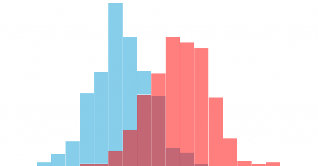
A Histogram is a vertical bar chart that depicts the distribution of a set of data.
Unlike Run Charts or Control Charts, which are discussed in other modules, a Histogram does not reflect process performance over time. It’s helpful to think of a Histogram as being like a snapshot, while a Run Chart or Control Chart is more like a movie
When to use:
Summarize large data sets graphically.
Compare process results with specification limits. If you add the process specification limits to your Histogram, you can determine quickly whether the current process was able to produce “good” products. Specification limits may take the form of length, weight, density, a quantity of materials to be delivered, or whatever is important for the product of a given process. A Histogram on which the specification limits have been superimposed.
Use a tool to assist in decision making. Certain shapes, sizes, and the spread of data have meanings that can help you in investigating problems and making decisions. But always bear in mind that if the data you have in hand isn’t recent, or you don’t know how the data were collected, it’s a waste of time trying to chart them. Measurements cannot be used for making decisions or predictions when they were produced by a process that is different from the current one, or were collected under unknown conditions.
How to use?
A histogram is made up of five parts:
Title: The title briefly describes the information that is contained in the Histogram.
Horizontal or X-Axis: The horizontal or X-axis shows you the scale of values into which the measurements fit. These measurements are generally grouped into intervals to help you summarize large data sets. Individual data points are not displayed.
Bars: The bars have two important characteristics—height and width. The height represents the number of times the values within an interval occurred. The width represents the length of the interval covered by the bar. It is the same for all bars.
Vertical or Y-Axis: The vertical or Y-axis is the scale that shows you the number of times the values within an interval occurred. The number of times is also referred to as “frequency.”
Legend: The legend provides additional information that documents where the data came from and how the measurements were gathered.